Calendar's colors are washed out and incorrect
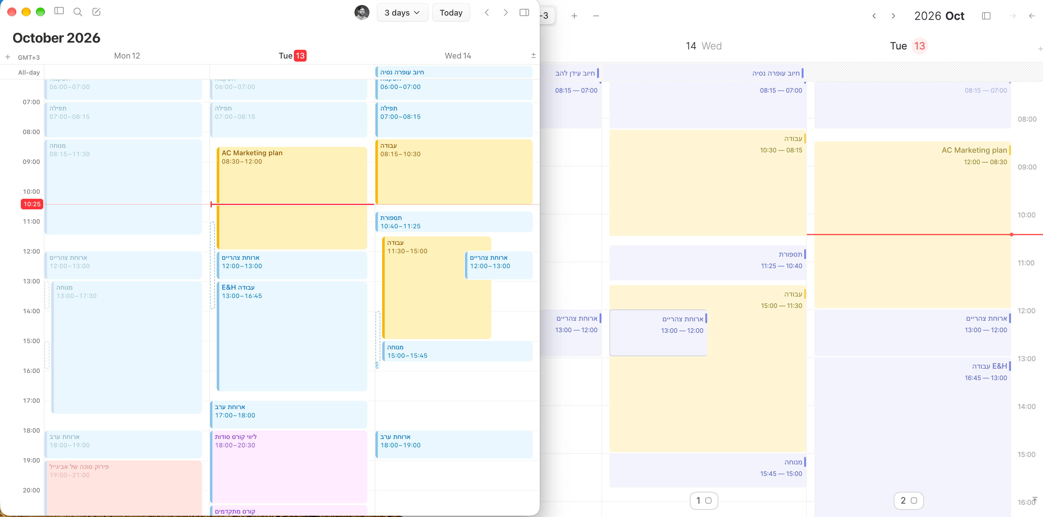
The colors in the app, both on mobile and desktop, are simply inaccurate. Some colors are displayed incorrectly' for example, blue appears as purple
The colors are also very washed out, making the text much harder to read and forcing the eyes to strain just to make out what's written.
I think the calendar needs a color refresh, with much better contrast to improve readability and reduce eye strain.
(The screenshot shows the difference between Routine and Notion Calendar MacOS app)
Thank you!
- Platforms
- macOS, iOS
Status: Rejected
No comments yet
Be the first to share your thoughts.